

USING THE MAP
Click here for instructions to navigate the vulnerability atlas in pdf format
For video instructions, follow the links below:
Click here to learn more about data exploration (Coming soon)
Click here to learn more about navigating the Atlas (Coming soon)
Click here to learn how to plot time series and download data (Coming soon)
Click here to learn more about Atlas indicators (Coming soon)
Click here to learn more about main findings and documents (Coming soon)
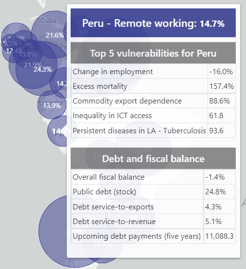
Hover over any country to see the top five indicators in which the country has the greatest vulnerability, as well as debt and fiscal balance indicators.
Visualizing vulnerability dimensions and indicators
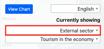
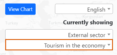
- Go to the double drop-down menu on the right.
- In the first menu, you can choose one of the twelve dimensions of vulnerability. You can also choose "debt and fiscal balance" to see related indicators.
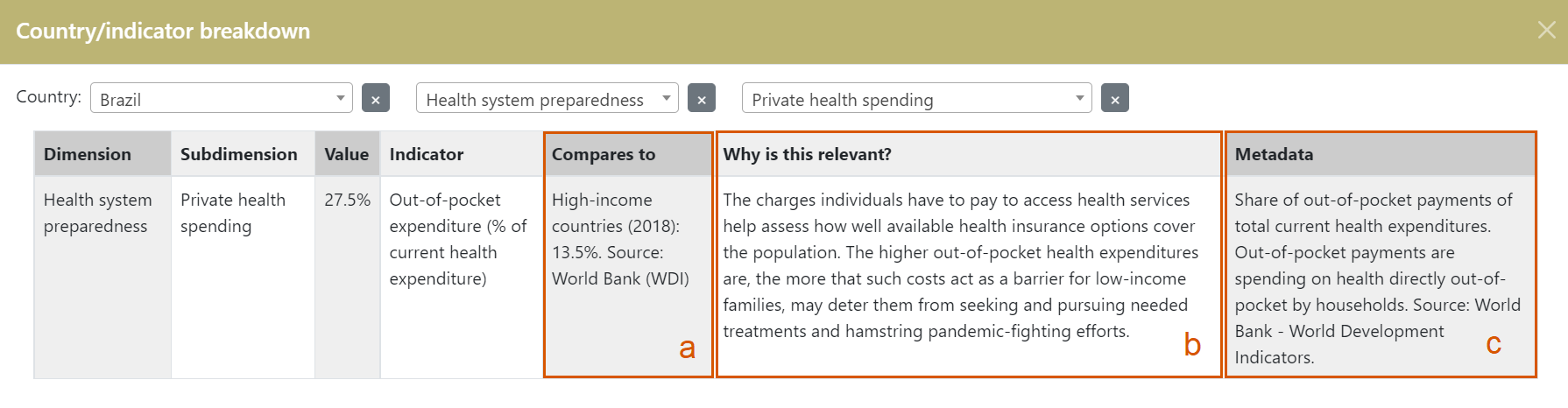
The bubbles show the indicator values for each country and by clicking on them you can see more information about the indicator, including:
a) a comparison figure that helps to put the value in context,
b) a brief explanation of the importance of the indicator as a measure of vulnerability in relation to the pandemic, and
c) a technical note defining and specifying parameters of the indicator and data source.
Charting time series
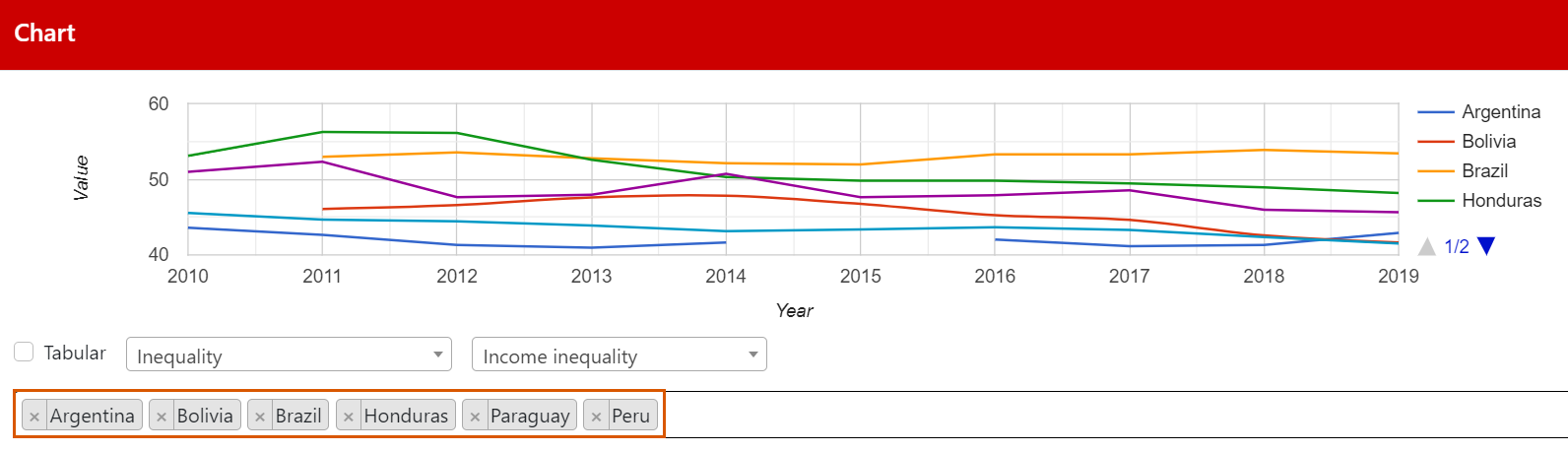
In addition, for the selected subdimension you can show a chart plotting the available time series, where available. Once you display a chart, use the “Select country” function to display and compare with the data for that same indicator in other countries.
Finally, you can download the data in the same section of the graph by clicking on "Tabular" and selecting the download format (Excel, CSV, PDF) or print the table.